
Federal Government Agency: Cybersecurity Dashboard

Description
Dept. of Housing & Urban Development (HUD)
2017
Overview:
The HUD CSF Dashboard purpose is to provide users with the means to quickly assess and monitor operational compliance with NIST Cyber Security Framework across Process Areas.
The key objective of the design is to allow stakeholders to quickly recognize problem areas and identify which systems need immediate attention. Visual cues and interactive elements should lead users directly to the contributing factors that impact Maturity Level Scores of Process Areas and Program Offices.
Further, the dashboard’s design required indicators that may be leveraged across the enterprise to increase employee awareness and engagement in cybersecurity compliance. Numeric scoring and colors establish conventions that are memorable and are easily digested by non-technical personnel.
My research on the audience for this app began with a guide called “The People Behind Government Cybersecurity” published by GovLoop. This guide offers a multi-faceted profile of six personnel personas who play a critical part in government cybersecurity.
Further guidance on design came from the project stakeholders and BA’s that had been working with the agency to secure the project.
Challenge:
The challenge of this design was that the UI must meet the following core objectives and system requirements:
- Relatable Color –Coded & Numeric Scoring Displays
- Contextual Organization Performance Trends
- Efficient & Controlled Access to Information
Solution:
This team project was unique in that this scoring system was brand new and developed by the Data Scientists on the project, so it was very important to establish a solid set of design and style conventions because those would set the user expectations and perceptions of the platform from the outset.
A few of the guidelines we set were:
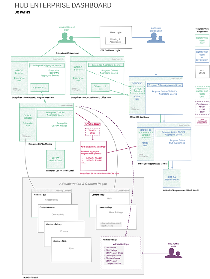
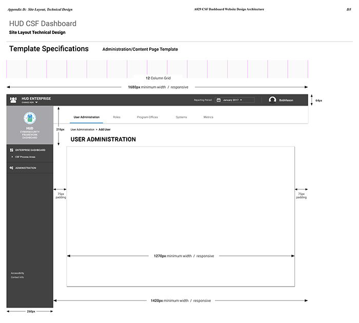
- To design a user interface that supports hierarchical views of multi-dimensional data for multiple user roles who may navigate through and across several layers of information.
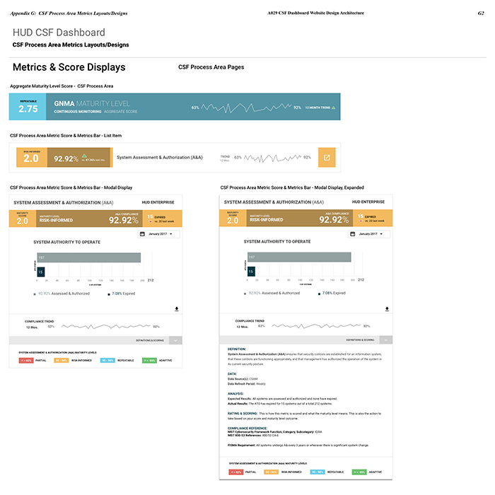
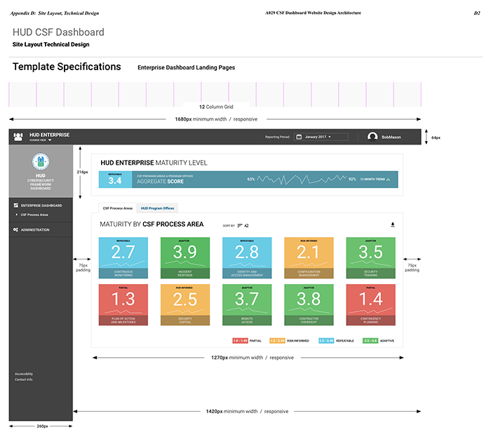
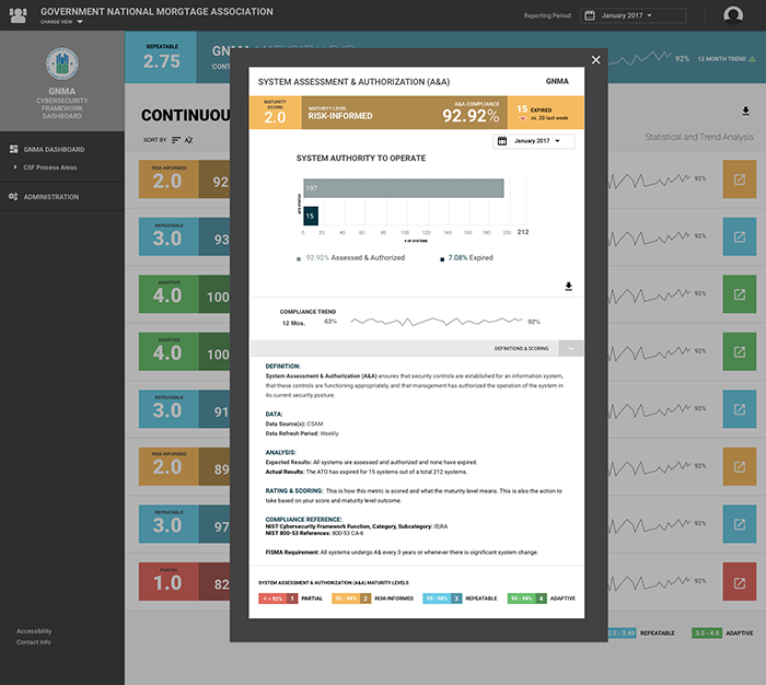
- Interface must be display through the common, color-coded scoring Maturity Level Score system, users may quickly view and gauge the Maturity Level for each Program Office, CSF Process Area and supporting metric via a very simple system interface.
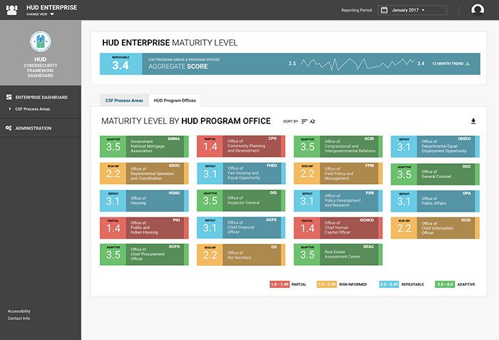
- Enterprise users will notice a second tab labeled “Program Offices” within the main area of their CSF Dashboard landing page. Toggling to that tab displays a color-coded grid containing the maturity level score box for each individual Program Office to allow users to gauge organizational performance of the Enterprise by office at a glance.
- A CSF Process Area landing page contains the display for individual CSF Process Area metrics, associated scores and trend data calculated from scores related to organizational systems. User may then dive deeper into individual system metrics – all using the same color and scoring system.
Outcome:
I created an interactive prototype using InVision App which was then turned into a real, live application that is being further developed today. It was quite exciting to design this interface – it being the first of its kind and a newly developed scoring system being introduced to multiple government agencies.